"Dashboards display information that is changing in real time."
"Dashboards can be interactive or non-interactive."
"Dashboards are designed to support real-time 'situation awareness.'"
This is a project designed with Kristine Kim and Michelle Zhu for the class 05392 Interaction Design Overview at Carnegie Mellon University. This interactive dashboard engages and meets the needs of multiple stakeholders (teachers and student presenters/listeners in a classroom setting).
The easy and simple dashboard design to motivate students to participate in giving feedback to their classmates and giving the instructor a nice overview of what is happening within their class in one screen.
Software: Adobe XD
PROCESS DESCRIPTION
Empathy Maps & Needs Analysis
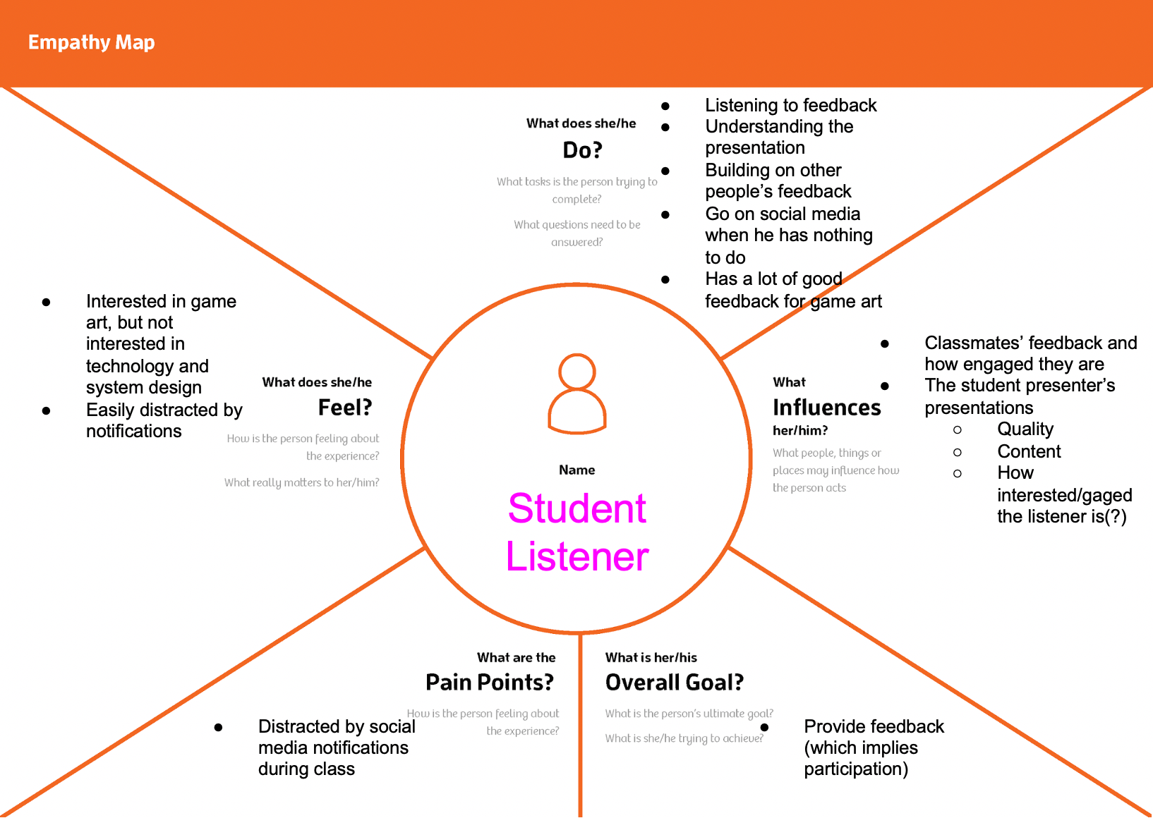
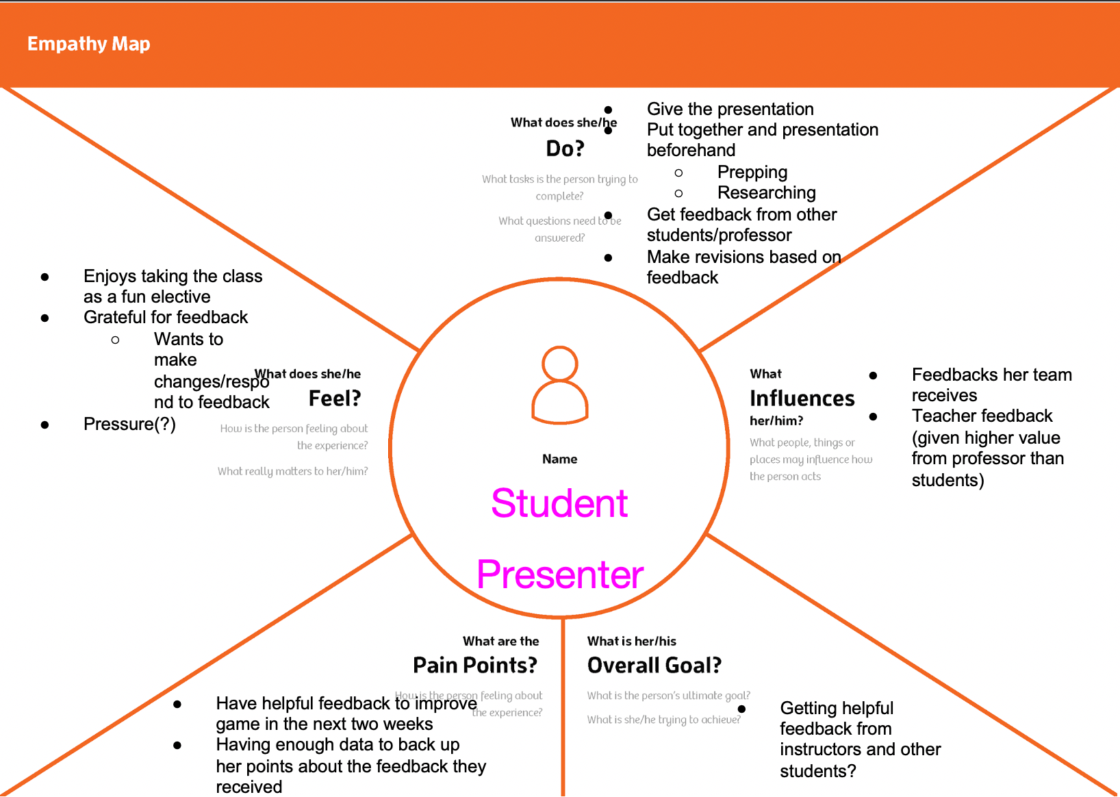
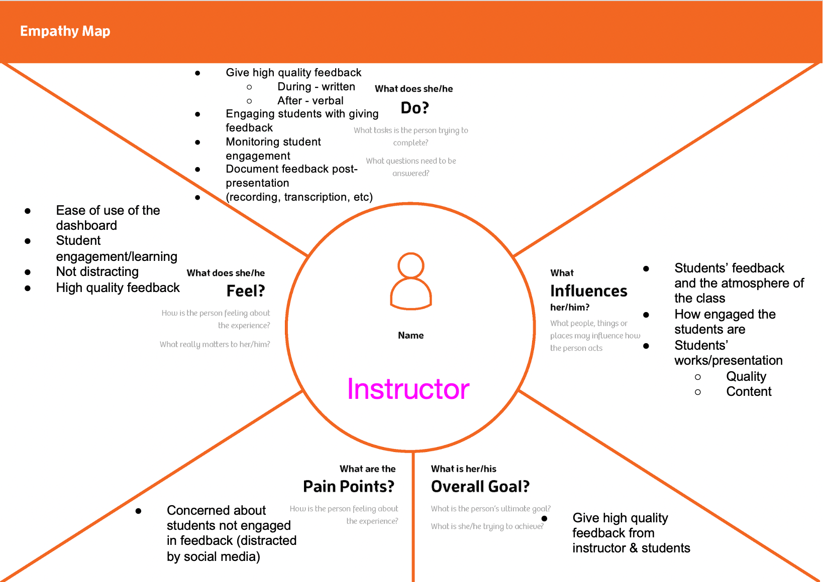
Here are the three empathy maps we made for the student presenter, student listener and instructor. By putting ourselves in the shoes of each of our stakeholders, we were able to get a good understanding of the human goals we were trying to achieve with our dashboard.
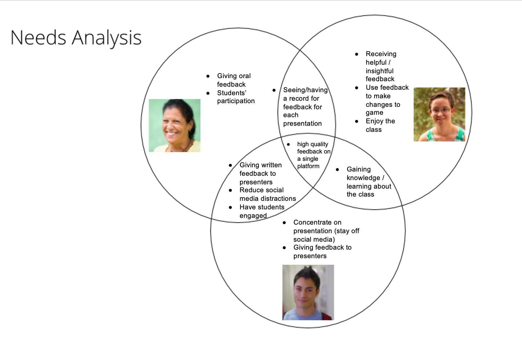
Based on our empathy maps for each of the student presenter, student listener, and the instructor, we were able to create a needs analysis venn-diagram for what each stakeholder needs from the dashboard.
Hand-drawn Rough Wireframes
From doing the empathy map, creating the needs analysis, and examining the given dataset, we tried to create variations of that featured the goals that the instructor and the student listener want out of the dashboard. These were the two most different iterations we came up with.
One allows the instructor to see comments that students are making and one allows the instructor to see comments and see who in the room has made comments, in addition to making comments of her own. The student listener view is simplified with one variation showing other students’ responses and the other only showing one’s own responses.
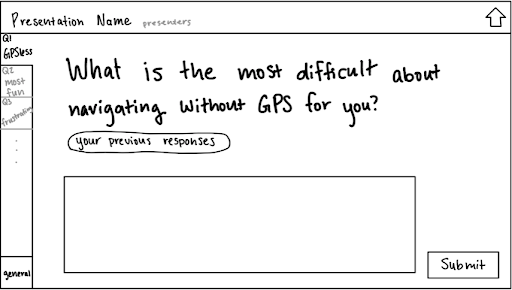
Student Listener View Ver.1

Instructor View Ver.1
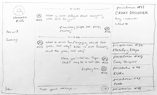
Student Listener View Ver.2

Instructor View Ver.2
Black & White Prototypes
We decided to take two approaches (typing comments or note taking) with the black/white prototypes, and we didn’t want the dashboard to be restricted to question-answering. We also wanted everything to be available on one page at a glance, without having lots of sub-pages or switching between views.
We decided to go with the comment prototype rather than the note-taking one, but we wanted to have a more organized way of giving comments so that it’s easier for the instructor/student presenters to view. Thus we pushed our column grid ideas further, and separated the feedback space into individual columns that’s organized by the questions of the student presenters (general feedback on the left + 3 question columns) asked by the presenters to get quality feedback for the most important questions).
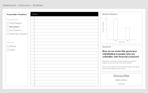
Note-taking Prototype
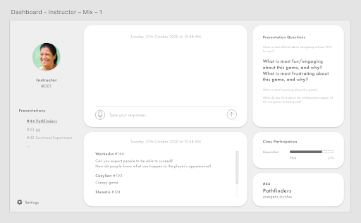
Comment-response Prototype
Final Prototype Draft (comment-response that follows a column layout)
Colour Testing
After we built our black and white prototype, we played about with a lot of different colour themes and see which one suited our design the best. Our goal for this dashboard was to provide a simple and easy design for the users to use and minimize distraction for the student listeners.
We played around with darker and lighter themes, bright and muted colours and after examining all of our prototypes, we decided that too much colour would cause unnecessary distractions and darker background would be too overwhelming. Therefore, we agreed upon a light gray background with one pop of colour (purple) through all of our features.
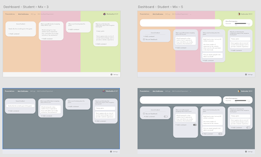
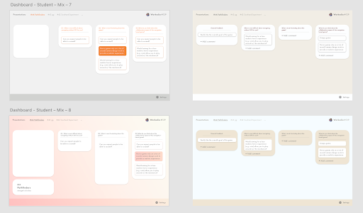
Final Colour Decision (A dash of calming purple with grey/white layout)
FINAL PROTOTYPE
We have put together an easy and simple dashboard design to motivate students to participate in giving feedback to their classmates and giving the instructor a nice overview of what is happening within their class in one screen.
We tried our best to stick with our intention of limiting distraction and helping the student listeners give high quality feedback, so we came with the ideas of only seeing one’s own comments during the presentation, incorporating upvoting time where all student comments are available anonymously after the presentation, adding comments to questions without any limits, and an area of general feedbacks towards the presenter.
For the instructor, we really wanted them to have a good view over the class with statistics of class participation, top comments, access to all the comments made by their students (toggle view), focus on responses to specific questions and the ability to release comments for students to upvote.
Student View (during the comment up-voting process, background turns to purple)
Instructor View (the toggle allows instructors to switch on and off student comments for the specific question)