"The coronavirus pandemic requires that people stay apart from friends, family, colleagues, neighbors, students, teachers — how might human-computer interaction help them connect, play, learn, or work together?"
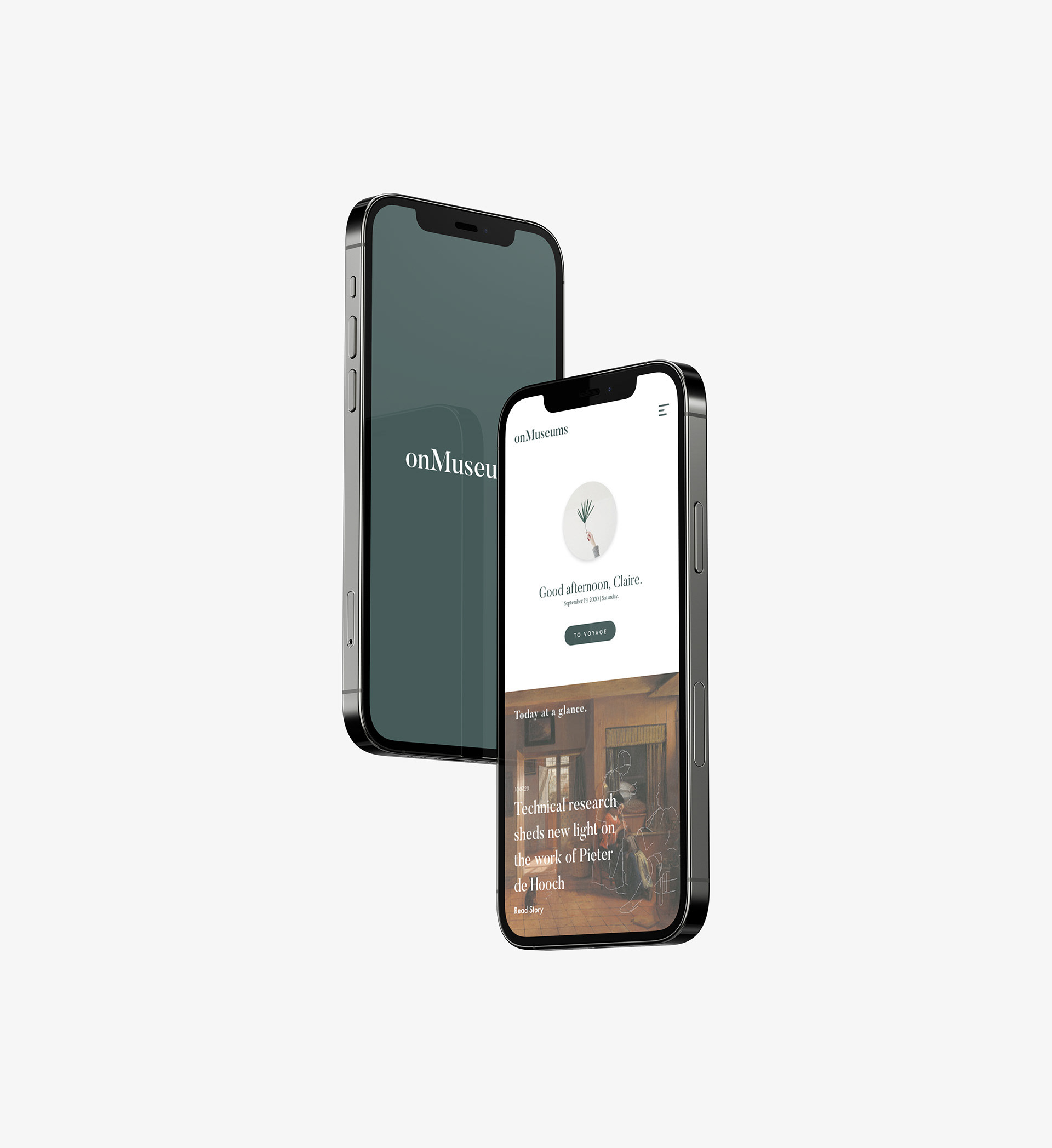
This is a project designed with Gabrielle Augustin, Aadya Bhartia, Solana Morningstar, and April Wu for the class 05392 Interaction Design Overview at Carnegie Mellon University. The project focuses on developing an interface for virtual museum visits, intending to provide opportunities for home-quarantined people to view museums and experience them while having the feeling of belonging to a larger community.
Through phases of research, interview, prototype, and user testing, we were able to identify the experiences people wish to look for in museums, and how people react to technology in art. The project emphasizes the importance of connecting research and prototype, and not lose track of the human-centered approach.
Software: Adobe XD


PROCESS DESCRIPTION
Research: Zoom Virtual Interviews + Virtual Museum Observations
After the secondary research, we were able to compile a set of 16 general interview questions targeting three areas (to help us keep consistency): interviewee’s general art/museum interests, past museum experiences, and personal suggestions for future museums. We then conducted 5 zoom interviews scattered within the age range of 14-30 to acquire relevant information.
We also explored museums with virtual tours, and observed the features and views they had available. Museums include Rijksmuseum, Vatican Museum, and so on. Some had virtual museum integrated in their own websites, some used google arts culture. Some had lots of additional features such as games/social media interactions, where some served more as a database of artworks.
Ideation: Affinity Diagram + Scenarios and Storyboards
After completing the secondary and primary researches, we were able to put together an affinity diagram. This was a relatively quick yet effective exercise (we completed this in an hour), because it helped us to filter out overlapping/excessive information. We condensed the research results into user needs that we should really focus on during the later stages.
After determining pain points and opportunities, each team member wrote three scenarios in which our app could be used to address these problems. As a group, we read through all the scenarios and collectively decided on the strongest one from each team member. Then everyone drew two storyboards to illustrate how the “How might we” statement was addressed.
Prototyping: Wireframe + Lo-Fi Prototype
After using the storyboards to help us begin to narrow the scope of our design, we all made individual wireframe sketches of what we envisioned the museum app might look like and how it would work. We then came together to discuss these sketches. We ended up taking our favorite parts from each wireframe and incorporated them into a collaborative wireframe.
Each team member created a lo-fi prototype, then we discussed and created a collaborative lo-fi prototype. This proved a bit challenging, as we all had different ideas about how features. We layed out all the screens and drew arrows between them to see the connectivity between the frames, then we compiled them all together in a large web.
Testing: Mid/Hi-Fi Prototypes + User Testing
For our mid/hi-fi prototypes, we created features that presented a communal sense (seeing everyone in the museum map, playing/drawing together, etc). We also implemented voice/video-call functions in the tour interface. We wanted people to complete puzzles together while communicating. Thus the interface had a chatbox available, but perhaps the voice/video call could also be implemented here.
To begin the usability testing, we wrote a brief set of instructions for the participants to follow. Then we documented their physical/verbal responses. Users overall seemed excited and enjoyed the visual design of the interface, and the feedback provided important insight on how to improve our design and make navigation easier, and correlated back to certain points we missed out on in our research phase.
FINAL PROTOTYPE