"User interfaces are points of contact between people and technology that determine in large part whether or not people are able to achieve their goals. Put another way, regardless of the technical capability of a system, the effectiveness of it depends on large part on the design of the interface."
This is a project designed for the class 05392 Interaction Design Overview at Carnegie Mellon University. This microsite presents information about the World Economic Forum annual meeting information. The site is designed to present relevant information in a minimalistic way, and make certain elements that would be consistent across all pages.
Software: Adobe InDesign, Adobe XD
PROCESS DESCRIPTION
Content Organization #1 + #2
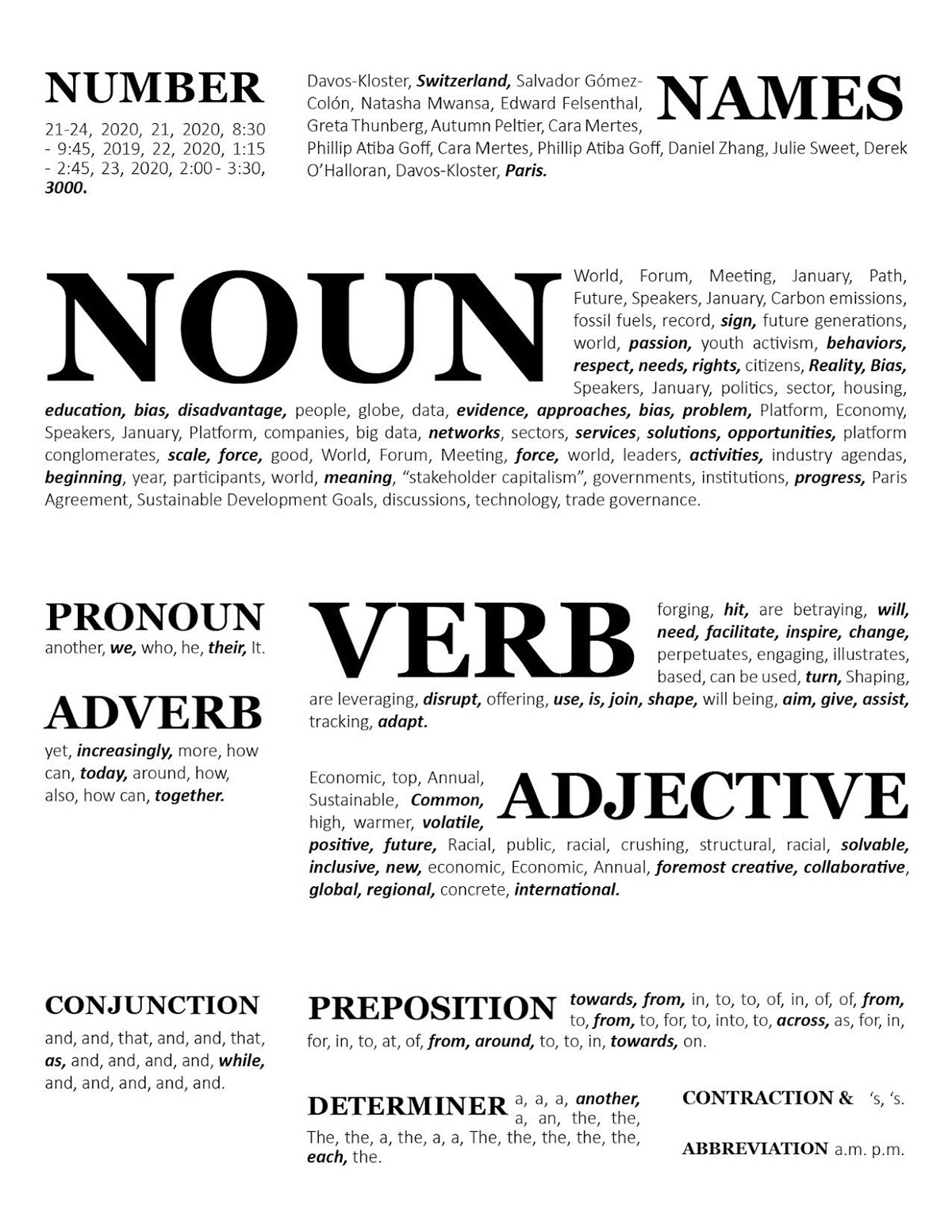
The first option organizes the data by parts of speech, which turns the data into a word bank. This form of organization might be useful for students who are learning sentence structures, or are looking for a word bank of related information. The titles of the word categories have different sizes based on how large the category is, in this case there is largest amounts of nouns in this data set. Different categories are also placed together based on their functions in a sentence.
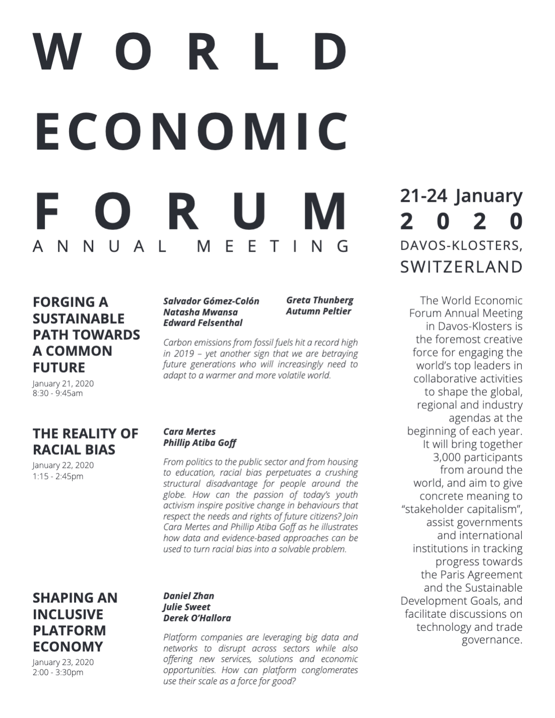
The second form of organization treats the data as an event schedule, first structured by date (days) and then sub-structured by name, date, location and description. This is potentially useful for individuals/organizations who are interested in the event and wish to look at schedule and quickly see relevant information. The hierarchy first prioritizes the name, date, and description of the general forum, then presents the specific events in a schedule format.


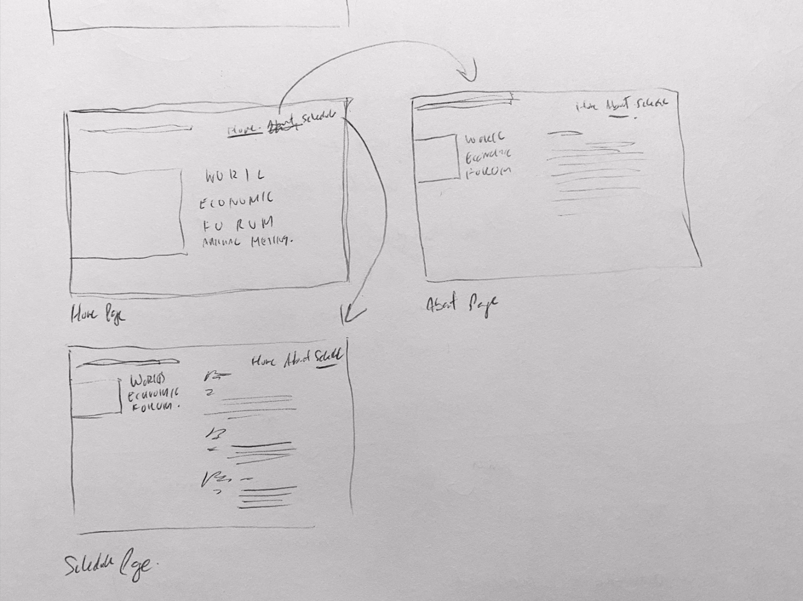
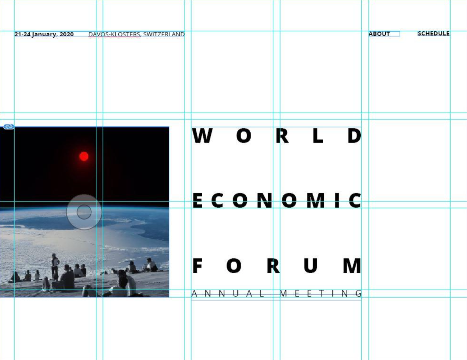
Wireframe Sketches + Grid Layout


FINAL PROTOTYPE